
Cream kitchen ideas start with a correction: cream is not a timid white, it is white with the temperature left in, and the temperature is the whole job.
Get the undertone right for your light and the room glows; get it wrong against brighter whites or warm bulbs and the same cabinets read yellow or dirty.
The system below runs on three tools: an LRV ladder of verified warm whites, a mismatch audit of your fixed whites, and four contrast currencies that keep a pale room alive. Every idea that follows is one of those tools at work.
The Fork: Cream Against White, Beige, and Greige
Four pale families compete for the same kitchen, and they differ by undertone, not just depth. Choosing the family first prevents nearly every cream mistake, because each family’s failure mode is different.
White’s failure is coldness, beige’s is heaviness, greige’s is ambiguity. Cream’s failure is the mismatch: it is the only pale family that can look wrong purely by standing next to a brighter relative.
|
Family |
LRV band |
Undertone |
Reads as |
Failure mode |
|---|---|---|---|---|
|
Crisp white |
88 to 94 |
Neutral or cool |
Clean, modern |
Sterile, blue in north light |
|
Cream |
74 to 90 |
Yellow or beige, definite |
Warm white |
Yellow cascade, dirty mismatch |
|
Beige |
45 to 65 |
Warm, saturated |
A color, not a white |
Heavy, dated company |
|
Greige |
55 to 75 |
Gray cooled beige |
Ambiguous neutral |
Muddy indecision |
The thumbnail test settles borderline cases in seconds. If the cabinets could be mistaken for white in a small photo, the kitchen is cream; if nobody would make that mistake, it is beige wearing cream’s name.
One ranking guide sells Accessible Beige as its cream look paint. At LRV about 58 that color is a beige greige, and printing the boundary honestly is part of this page’s job.
The Warm White Ladder
These figures come from manufacturer data as compiled in Kylie M Interiors’ White Dove comparisons and the verified research behind this series. Read the ladder by behavior, not by brightness alone, because two creams at the same LRV can act very differently in warm light.
|
Cream |
Code |
LRV |
Undertone behavior |
Best use |
|---|---|---|---|---|
|
Simply White |
BM OC-117 |
89.52 |
Clean yellow, carried far by brightness |
Fixed bright whites, dim rooms |
|
Mascarpone |
BM AF-20 |
89 |
Soft bright cream |
Bright traditional kitchens |
|
Greek Villa |
SW 7551 |
84 |
Yellow with a green hint |
Farmhouse, lively warmth |
|
White Dove |
BM OC-17 |
83.16 |
Yellow muted by gray |
The balanced default |
|
Dover White |
SW 6385 |
about 83 |
Slightly more yellow than Swiss Coffee |
Sherwin Williams households |
|
Alabaster |
SW 7008 |
82 |
Creamy, pronounced warmth |
North and dim kitchens |
|
Swiss Coffee |
BM OC-45 |
81.91 |
Creamy yellow, a touch of green inside |
Traditional warmth, brass |
|
Dove Wing |
BM OC-18 |
74.19 |
Deep warm presence |
Large bright rooms, two tone |
White Dove is the default for a reason worth understanding. Its warmth is muted by gray, so it is the cream least likely to fight counters, metals, or neighboring whites, which is why consultants keep returning to it.
Cloud White OC-130 stands just off the table as the warmest classic, brighter than White Dove and definitively cream. One gallery in this search mislabels it with White Dove’s code, OC-17; codes are decisions, so verify them before any order.
Simply White holds the ladder’s paradox. It is the brightest cream here, yet it can appear more yellow than deeper creams, because brightness carries its clean yellow undertone further across a room.
Undertone Behavior: The Yellow Cascade and the Green Flash
Cream’s warmth compounds, and the compounding has a name in this kitchen: the yellow cascade. A yellow undertone paint, under warm bulbs, in warm sunlight, beside warm wood, adds yellow at every layer until the room tips amber.
Alabaster carries the documented caution: designer comparisons note it can pick up a yellow cast in warm artificial light or strong south facing light. In a dim north room that identical behavior is the entire point of choosing it.
Swiss Coffee carries the subtler risk. Kylie M Interiors’ Swiss Coffee comparisons documents a touch of green tucked inside its yellow, which can flash in certain lights and beside certain grays, a behavior worth a board test before a full kitchen.
The cascade’s control is order of operations. Fix the bulb temperature first, then the paint choice, then the anchor, because each step down that list costs more than the one before it.
The Mismatch Audit
Cream’s most common real world failure is not yellowing; it is comparison. A warm white at LRV 82 beside an appliance white near LRV 90 with a blue tone reads as the soiled version of the brighter color.
Audit these fixed whites before choosing the cream:
- Appliances: the brightest, bluest whites in most kitchens
- Glossy tile and tubs: bright whites hiding in backsplashes and baths nearby
- Quartz counters: many whites are blue based under their veining
- Existing trim and ceilings: yesterday’s white is today’s mismatch
The audit ends in one of three fixes. Choose the brightest, least yellow cream, panel or replace the worst offender, or drench the room so no brighter white survives to make the comparison.
The Dose Ladder
Cream scales from a cabinet color to a whole room system, and each dose changes the contrast job. Pick the dose before the paint, because the right cream at one dose is the wrong cream at the next.
1. Cabinets only, contrasting walls. The classic scheme: cream cabinetry against a warm greige or soft color wall, contrast supplied by the wall.
2. Cabinets and trim, walls a step deeper. The transitional scheme: the woodwork joins the cream family and the wall becomes the field.
3. Cabinets a shade warmer than white walls. The subtle scheme galleries love: variation you feel before you see it.
4. Full drench. Cabinets, walls, trim, and ceiling in one cream, contrast supplied entirely by texture, sheen, wood, and the anchor.
The same temperature first approach organizes cream bathroom ideas, where the whites are smaller but the mismatch rules are identical. Carry one ladder through the home and the rooms agree with each other.
Counters: Warm Veining Is the Bridge
Calacatta Gold marble and Taj Mahal quartzite lead the documented pairings for a mechanical reason. Their honey and amber veining repeats cream’s undertone inside the stone, so counter and cabinet read as relatives.
Warm based white quartz works when its base is warm rather than blue. The slab test is non negotiable: hold the painted cabinet sample against the actual slab, because a photograph of veining lies about temperature.
Butcher block serves the cottage and farmhouse registers and doubles as texture. Cool gray veined marble is the caution zone, the stone most likely to make cream read yellow by comparison.
Backsplash: Sheen Is the Contrast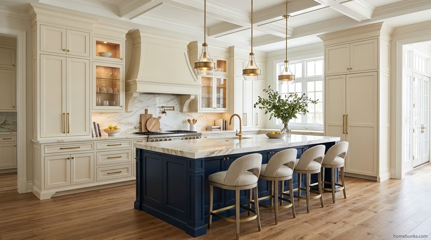
The tone on tone backsplash works because gloss is a contrast currency. A documented pairing sets matte cream cabinets against glossy textured white tile, and the eye reads the sheen difference as depth.
Warm white subway is the default for a reason: cheap, classic, and warm enough not to trigger the mismatch. Grout in a warm greige keeps the field soft where a bright white grout would stripe it.
Handmade look zellige in cream adds the texture currency on top of the sheen. Marble carried up from the counter is the luxury version, one material making both decisions at once.
Hardware and Metals: Warmth, Repeated
The consensus across the galleries is unusually firm: brass, brushed gold, and bronze bring out cream’s warmth, and unlacquered brass adds a living patina that deepens the traditional register over years.
Matte black is the sanctioned modern accent, the small dark anchor in metal form. Whatever metal leads, repeat it across faucet and lighting, because a metal used once is an object and used three times is a system.
Chrome and polished nickel are the cool risk. They can sit acceptably beside balanced creams like White Dove, but they fight the warmer creams and can chill the whole scheme at the handles, where hands and eyes land daily.
Floors: The Warm Base
Light to mid oak and walnut floors ground pale cabinets and continue the temperature system downward. The gallery record repeats this pairing so consistently that a cool floor should be treated as a fixed element to mediate, not a neutral.
Warm checkerboard serves the cottage register, and limestone look tile serves the traditional one. Between counter and floor, the room’s warmth should be audible in every material name you say out loud.
An open plan in this palette runs naturally into white and beige living room ideas, where the same warm whites carry the seating side. One undertone family across the open floor is what makes the two rooms read as one decision.
The Island Anchor
A wall of cream needs one dark thing to organize around, and the island is its designated place. Deep navy, forest or olive green, walnut, and black are the documented anchors in the warm white coverage.
The deepest version of that anchor, at full room scale, lives in navy blue kitchen ideas. In a cream kitchen the same navy is rationed to the island, which is exactly the dose that keeps the pale field serene.
White oak islands serve the soft modern register, anchoring by texture and mid tone rather than darkness. The rule survives every version: one anchor, singular, or the kitchen becomes an argument between two statements.
Styles: Where Cream Is Native
Traditional and transitional kitchens are cream’s home ground, with shaker fronts, framed construction, and warm metals. It is no accident that the reference cottage kitchens in this search, deVOL’s cream Shaker rooms, sit squarely in this register.
Farmhouse takes cream with shiplap, apron sinks, and brass. English country and cottage take it with beadboard, bronze, and vintage furniture, where cream’s softness is the entire aesthetic argument.
Modern kitchens take cream as a softening agent: slab fronts and minimal hardware, the clinical edge removed. The style that must argue for cream is high contrast Scandinavian, which runs on crisp whites by doctrine.
Light: North Spends Warmth, South Audits It
North facing kitchens are cream’s clearest win. Cool, weak daylight turns bright whites blue gray and sterile, while cream’s undertone counterfeits the missing sun, which is why consultants name these warm whites for north rooms.
South facing kitchens run the audit instead: strong warm sun spends yellow for you, so choose the gray muted creams, keep bulbs neutral, and sample at the sunniest hour. The paint that flatters at breakfast can shout at noon.
Bulb temperature is the controllable sun. The band is 3000 to 3500K, warm enough to honor the undertone and neutral enough not to add a second layer of yellow to it.
Under cabinet lighting matters disproportionately here, because it is the light that actually strikes the cabinet fronts during working hours. In pale kitchens the evening light is the design, not an afterthought.
The Contrast Currencies
When a cream kitchen feels flat, the color is almost never the problem. The contrast budget has been spent to zero, and it can be refilled in four currencies that are not color at all.
Texture is the first refill: handmade tile, shiplap, beadboard, riven stone, linen. Sheen is the second: matte against gloss, honed against satin, each surface bending light at a different angle.
Material is the third: wood grain, aged metal, woven cane, living plants. The anchor is the fourth and last: one dark or deep element, spent once, that gives the pale field its organizing weight.
The galleries behind this search return to this system constantly, in rooms credited to Michelle Berwick Design and Cathie Hong Interiors among others.
The Spruce’s cream cabinet collection documents several of these rooms, and the pattern across them is the currencies, not any single product.
Two Tone and the Split Cream
Two tone in a cream kitchen usually means cream plus the anchor: cream perimeter, island in navy, green, wood, or black. The split that stays inside the family is subtler and worth knowing: cabinets a step deeper or brighter than walls.
That split is how a drenched room keeps its architecture legible, doors and frames reading against walls at a distance of one LRV step. It is contrast at the smallest dose that still works.
Uppers brighter, lowers deeper is the two tone version for tall rooms: Dove Wing class depth below, Simply White class brightness above, gravity and light both served. Sample the pair together, because splits are relationships, not colors.
The Repaint Protocol
Painting cabinets cream follows the standard protocol with two cream specific footnotes. Degrease, sand, bonding primer, and a waterborne cabinet enamel in satin, then respect the cure before hard use.
Footnote one is chemistry: oil and alkyd paints yellow as they age, so the modern enamel class is not a preference but the mechanism that keeps cream cream.
Footnote two is the audit: test the new color against every fixed white before the first coat.
The same discipline governs the palette’s bathroom expression in warm beige bathroom ideas, where warm neutrals meet the same bright porcelain. Pale colors are a whole house system or a series of small arguments.
Three Rooms Read Closely
The deVOL cottage kitchen works because every currency is spent: cream Shaker fronts, bronze pulls, shiplap walls, vintage furniture as texture. Nothing in the room is bright white, so the cream never faces the comparison it would lose.
The modern Berwick kitchen runs cream across full height built ins against a light oak island, Lucite and gold toned stools adding sheen contrast. The lesson is that cream at full dose reads architectural, not decorative, when the fronts stay plain.
The minimalist Hong kitchen pairs cream bases with pale wood shelving on white tile, restraint as the style. Its white tile survives the mismatch test because the cream is bright and the tile is warm, a pairing verified by proximity rather than assumed.
Working With What Is Fixed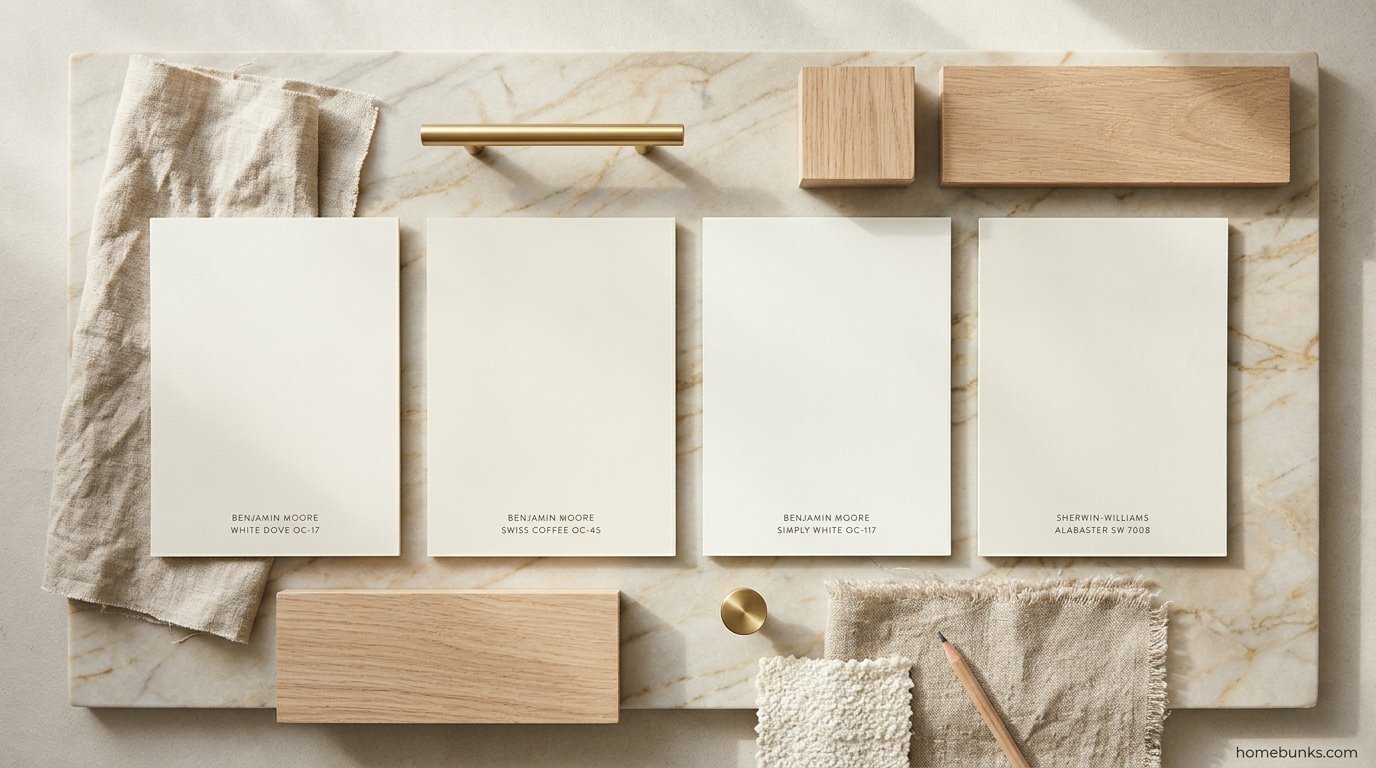
Most cream kitchens are renovations, not new builds, which means some elements are staying. The fixed elements vote first, and the cream that wins is the one that can live with the loudest voter.
Fixed warm elements (honey floors, beige granite, brass era fixtures) argue for the warmer creams and punish the muted ones, which can look gray and tired beside real warmth. Meet warmth with warmth and moderate it with the anchor.
Fixed cool elements (gray counters, stainless everything, blue gray tile) argue the opposite: White Dove’s gray muting or Shoji White’s greige mediation. If the cool elements dominate and cannot be mediated, the honest answer may be a crisper white.
Fixed bright whites argue for Simply White or for drenching past them. What never works is pretending the fixed elements are neutral: in a cream kitchen every survivor from the old room is a participant.
Mistakes That Date or Defeat Cream
1. Choosing from the chip alone. Warm whites shift more between chip and room than almost any family; the board test exists because chips lie.
2. Ignoring the fixed whites. The appliance mismatch discovered after painting is the most expensive sentence in this topic.
3. Warm bulbs on warm paint. The 2700K cascade turns a chosen cream into an unchosen amber by dinner.
4. Copying codes from captions. A top gallery mislabels a famous cream with another color’s code in this very search; verify codes at the manufacturer.
5. Three accent families. One accent repeated is design; three competing accents in a pale room is indecision made visible.
Costs, in Kind
No verified US dataset prices cream kitchens as a category, so this page prints no invented figures. The honest cost structure is simple: cream costs what the same kitchen in any color costs, because the color itself is free.
The real budget lines are the currencies: the enamel repaint, the anchor island finish, the handmade tile, the brass. Spend on the currency your room lacks rather than on a more expensive shade of the same warmth.
A staged plan buys paint and bulbs first, because the cascade fix is the cheapest transformation in the topic. Hardware follows, then the anchor, then stone, each stage livable before the next begins.
Sampling: The Paper Test and the Board Test
The paper test finds the undertone in ten seconds: hold the chip against plain white printer paper. The undertone that hides on the strip announces itself against true white, yellow creams going visibly golden.
The board test decides the kitchen: paint large boards, not wall patches, and move them between cabinet height and counter height across a full day. Warm whites change more between morning and evening than any other family on the wall.
Sample at the warmest hour your kitchen actually has, not the kindest. A cream chosen at its worst light behaves at every other hour, and the reverse is the topic’s most repeated regret.
The Wider Cream Set: Sherwin Williams’ Named Creams
Beyond the ladder sit the colors the trade lists file under cream by name: Creamy SW 7012, a true cream described as gentle without going too yellow, and Antique White SW 6119, a warm beige cream built for traditional rooms.
White Flour SW 7102 is the bright modern farmhouse entry, and Ivory Lace SW 7013 the soft elegant one. Crisp Linen SW 6378 runs the most neutral of the set, the transitional designer’s cream.
These colors teach the same lesson as the ladder: named cream spans a wide warmth range, from near neutral to frankly beige. The name on the strip is marketing; the undertone on your board is the fact.
Navajo White, the vintage Benjamin Moore cream, belongs in any honest survey as the cautionary ancestor: beloved in its era, deeper and more saturated than today’s creams, and the color many cream skeptics are actually picturing.
The Three Board Sample Set
Sampling works best as a set with assigned jobs, not a scatter of maybes. Three boards cover the decision for most kitchens, and each board exists to answer a different question.
Board one, the default: White Dove or Dover White, the gray muted middle. This board answers whether the balanced cream is enough, and in most kitchens it is.
Board two, the warmer wish: Swiss Coffee, Alabaster, or Greek Villa, one step creamier. This board answers what your light does to real warmth, cascade and green flash included.
Board three, the mismatch insurance: Simply White, the brightest cream. This board answers the audit: if your appliances and tile are bright, this is the cream that survives beside them.
Judge the set at three moments: morning, the warmest hour, and evening under your actual bulbs. The board that survives all three without an excuse is the kitchen’s cream, and it usually identifies itself without debate.
Open Plan and Small Kitchens
In open plan homes cream does quiet structural work: one warm white across kitchen and living zones erases the seam between cooking and sitting. The island anchor becomes the only boundary the two rooms need.
Keep the living side’s textiles inside the same temperature, warm woods and linen rather than cool grays. A single undertone family is the cheapest square footage a small open plan can buy.
In small kitchens, drench rather than contrast: one cream on cabinets and walls, satin sheen for bounce, and the anchor kept to hardware scale. The room reads as one warm envelope instead of a collection of small competing surfaces.
The brightness math favors cream here more than anywhere. At ladder LRVs the light return nearly matches white, while the warmth keeps a windowless galley from feeling like the inside of an appliance.
Carrying Cream Through the Home
Cream works hardest as a house system: one ladder, related depths, every room warm in the same language. The kitchen at full dose, the bedrooms quieter, the baths brightest, all agreeing on undertone.
The palette at rest lives in cream bedroom ideas, where the same warm whites meet linen and wood. And sage green kitchen ideas is the fork’s other exit, for readers whose warmth wants a color attached to it.
Start where the light is worst, usually the north kitchen, and let the room that needs cream most set the house’s temperature. The rest of the rooms simply inherit a decision already proven.
The wider HomeBunks library runs this same ladder logic through its bathroom, bedroom, and living room guides. One undertone family, chosen once and carried honestly, is the quiet definition of a house that feels designed.
Frequently Asked Questions
What is a cream kitchen?
A kitchen built on warm whites: cabinets in whites carrying a yellow or beige undertone, at LRV roughly 74 to 90.
Cream sits between bright white and beige: cleaner than beige, warmer and softer than white.
What is the difference between cream and white kitchen cabinets?
Undertone and intent. White cabinets read clean, bright, and modern and contrast with warm materials.
Cream cabinets read soft and forgiving and harmonize with wood, brass, and warm stone instead.
What is the best cream paint color for kitchen cabinets?
The balanced default is Benjamin Moore White Dove OC-17, LRV 83.16: warm, but gray muted enough to stay versatile.
For more cream character, choose Swiss Coffee OC-45. Sherwin Williams’ counterpart is Alabaster SW 7008.
Is White Dove a cream or a white?
Both, depending on company: against bright whites White Dove reads cream; against creams it reads white.
That in between position is its value beside existing counters, tile, or appliances.
Swiss Coffee or White Dove for cabinets?
Swiss Coffee is warmer and creamier, better for traditional rooms and brass; its quirk is a touch of green inside the yellow.
White Dove is brighter and safer. Warm lit rooms favor White Dove; dim rooms favor Swiss Coffee.
What is Alabaster by Sherwin Williams on cabinets?
SW 7008, LRV 82: a soft creamy off white, warmer than White Dove and one of the most used cabinet whites in North America.
Its caution is a yellow cast under warm artificial or south light. Sample at the warmest hour.
Are cream kitchen cabinets outdated?
No. Cream is the designer correction to the stark white decade: softer, warmer, and more forgiving.
What dates a kitchen is the 2003 company cream once kept, not the color. With shaker fronts and warm metals, cream reads current.
Why do cream cabinets sometimes look yellow?
Three causes compound: the paint’s yellow undertone, warm light from south windows and 2700K bulbs, and contrast starvation.
Fix in order: a gray muted cream, bulbs at 3000 to 3500K, and one dark anchor to rest the eye.
Why do cream cabinets look dirty next to white appliances or tile?
The comparison defines the color: a warm white beside a brighter, bluer appliance white reads as its soiled version.
Fixes: the brightest cream, paneling the offender, or drenching so no brighter white survives.
What colors go with cream kitchen cabinets?
Warmth’s family: warm woods, brass and bronze, warm veined marble, sage and olive as soft accents, navy and black as anchors.
Cool grays and blue whites are the documented discord. Mediate fixed grays with wood and brass.
What countertop goes with cream cabinets?
Warm veined stone leads: Calacatta Gold and Taj Mahal quartzite bring honey and amber veining that rhymes with cream.
Warm based white quartz and butcher block work. Test cool gray veined stone against the cabinet sample first.
What backsplash works with cream cabinets?
The tone on tone move: tile a step brighter or deeper than the cabinets, contrast from sheen and texture.
Warm white subway is the default, zellige style cream the handmade register, marble carried up the luxury version.
What hardware suits cream cabinets?
Warm metals: brass, brushed gold, and bronze bring out cream’s warmth, and repetition makes them a system.
Matte black is the modern anchor accent. Chrome fights the warmer creams; test it against balanced ones only.
What color island works with cream cabinets?
The island is cream’s designated contrast: deep navy, forest or olive green, walnut, or black.
White oak serves the soft modern register. Keep it singular: one statement, everything else in the cream family.
What flooring goes with cream kitchen cabinets?
Warm wood first: light to mid oak and walnut ground the pale cabinets, and the galleries repeat the pairing.
Tile floors should run warm too. Cool gray floors are the mismatch to test hardest.
What wall color goes with cream cabinets?
Two strategies: the near match, walls a shade warmer or paler for a drenched effect, and the soft contrast of a warm greige field.
Stark white walls are the documented failure: they make cream look like a mistake.
Can cream work in a modern kitchen?
Yes, as the softening agent: flat panel cream cabinets carry the modern layout without the clinical edge.
The discipline is restraint: slab fronts, minimal hardware, texture from stone and wood, one deliberate hard contrast.
Can cream work in a small kitchen?
Cream is arguably the small kitchen’s best color: near white’s light return with warmth a windowless box needs.
Drench one cream across cabinets and walls, use satin sheens, and keep the dark anchor small.
What is the difference between cream and beige in a kitchen?
Depth. Cream is a tint: white warmed with yellow, LRV 74 to 90, reading as a white.
Beige is a mid tone, LRV about 45 to 65, reading as a color. The thumbnail test decides.
What is the difference between cream and greige?
Greige is beige cooled with gray until warmth is ambiguous; cream is white warmed with yellow until warmth is definite.
Shoji White is the boundary case. Choose greige for mixed temperature rooms, cream for warm ones.
Do cream cabinets show dirt?
Less than bright white: the warm undertone camouflages the everyday film that makes pure white look dingy by Tuesday.
The trade is finish aging: specify modern waterborne enamel, not yellowing oil paint.
Will cream cabinets yellow over time?
The paint can, by chemistry: oil and alkyd paints yellow with age, while modern waterborne cabinet enamels stay true.
Keep bulbs at a consistent 3000 to 3500K and the sampled color is the color you keep.
What is color drenching in a cream kitchen?
One cream across cabinets, walls, trim, and ceiling, so contrast comes only from texture, sheen, wood, and the anchor.
It is also the mechanical fix for the mismatch: with no brighter white left, cream cannot look dirty.
How do I add contrast to a cream kitchen without another color?
Use the three non color contrasts: texture, sheen, and material.
Matte cabinets against glossy tile, honed counters against wood, aged brass against both. If all three are spent, the one dark anchor is the exception.
What lighting temperature suits a cream kitchen?
The balanced band is 3000 to 3500K: warm enough to honor the undertone, neutral enough not to add more yellow.
2700K compounds creams toward amber; 5000K makes them look dingy gray.
Cream cabinets in a north facing kitchen?
Cream is the recommended answer to north light: cool daylight turns bright whites blue gray and sterile.
Cream’s undertone counterfeits the missing warmth. Bright creams serve dim rooms; deeper creams serve north rooms with windows.
Cream cabinets in a south facing kitchen?
Run the yellow audit: strong sun adds yellow to yellow, the documented Alabaster caution.
Prefer gray muted creams, keep bulbs neutral, add a dark anchor, and sample at the sunniest hour, not the kindest.
What is Dover White by Sherwin Williams?
SW 6385, LRV about 83: a soft creamy white and a cabinet best seller, leaning slightly more yellow than Swiss Coffee.
It is Sherwin Williams’ nearest analogue in the White Dove conversation, useful when the house runs on that brand.
What is Greek Villa by Sherwin Williams?
SW 7551, LRV 84: a warm creamy white with a yellow green undertone, classed warm and creamy by designers.
It is the liveliest bright cream. Sample it carefully beside gray counters, where green hints show first.
What is Shoji White by Sherwin Williams?
SW 7042: the warm greige of the cabinet whites, recommended for organic, layered kitchens.
Shoji mediates when fixed elements mix warm and cool. It is not the choice when the brief is unmistakably cream.
What is Dove Wing by Benjamin Moore?
OC-18, LRV 74.19: the deep end of the cream ladder, reading as a color rather than a white.
Dove Wing serves large bright kitchens and two tone schemes. In small dim rooms it spends light the room lacks.
What is Simply White by Benjamin Moore?
OC-117, LRV 89.52: the brightest warm white here, capable of appearing more yellow than deeper creams because brightness carries undertone.
It is the problem solver for fixed bright whites and the risk in sun flooded rooms.
What is Cloud White by Benjamin Moore?
OC-130: the warmest classic in this set, cream yellow in undertone, and the early 2000s’ most popular white.
One gallery mislabels it OC-17, which is White Dove. Codes matter: the two colors are a real decision apart.
Can I paint my white cabinets cream?
Yes: the standard repaint protocol, color shifted one family warmer.
The real work is the audit: test walls, tile, counters, and appliances against the new sample before the first coat, not after the last.
What sheen is best for cream cabinets?
Satin: cleanable, luminous, forgiving. Gloss amplifies any yellowing tendency under warm light.
Tone on tone kitchens often split sheens: satin cabinets against a glossier tile, contrast manufactured from light itself.
Do cream cabinets work with gray countertops?
The hardest common pairing, workable with mediation: a gray muted cream, wood and brass repeated between the surfaces, warm grays in the stone.
If the gray is fixed and blue toned, a crisper white may honestly serve better.
What accent colors work in a cream kitchen?
Soft accents: sage and olive, muted blue, warm taupe and terracotta. Anchors: navy, forest, black.
The discipline is dose: one accent family repeated three times reads as design; three families read as indecision.
Is a cream kitchen good for resale?
Cream sits in the resale safe neutral family while reading warmer and more current than stark white.
The risks are execution: a cream kitchen photographed yellow or mismatched against brighter whites underperforms a clean white one.
What style kitchens suit cream cabinets?
Traditional and transitional first, then cottage, English country, and farmhouse, plus the softened modern register.
High contrast Scandinavian and industrial schemes run on crisp whites; cream there must be a deliberate softening, not a default.
How do I keep a cream kitchen from looking flat?
Diagnose the missing contrast: add sheen, texture, the anchor, or split the cream’s depth between cabinets and walls.
Flatness is a contrast budget spent to zero. Any one of the four currencies refills it.
Can cream cabinets pair with a wood island?
It is the signature warm combination: cream perimeter, wood island, giving the room its anchor, texture, and warmth echo in one move.
Keep the wood warm, repeat it once more, and let warm veined counters bridge the two.
What is the warmest cream paint for cabinets?
Warmth means visible yellow undertone: Cloud White and Greek Villa lead, then Alabaster and Swiss Coffee, with White Dove most muted.
Match warmth to the room’s light, not to the maximum. Sunny rooms are already spending it for you.
Conclusion
Cream kitchen ideas succeed when the undertone is chosen for the light, the fixed whites are audited, and the room is kept alive by texture, sheen, material, and one anchor.
The ladder gives you the color, the audit protects it, and the currencies give a pale room its depth.
Start with three boards: White Dove as the default, one warmer cream your light may deserve, and one brighter cream your appliances may demand. Live with them through a full day, then commit to the cream your kitchen’s own light keeps choosing.


