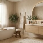
Cream bathroom ideas start where plain white bathrooms stop feeling good. Cream is white with warmth in it, and that warmth changes how a room feels at 7 in the morning.
Stark white reflects light flatly and can turn clinical in north facing rooms. Cream keeps almost all the brightness and adds the calm your skin and wood finishes prefer.
Most cream bathrooms that disappoint were not badly colored. They were lit wrong, grouted wrong, or left too flat to hold the eye.
What follows is the complete system: cream versus white decided properly, the paint depth ladder with verified data, the combinations that carry cream, and the fixes for its one famous trap.
Cream vs White: The Decision That Starts Everything
White and cream sit close on a paint chart and far apart in a room. The table below is the honest version of the choice.
|
Factor |
Cream |
Stark white |
|---|---|---|
|
Light feel |
Bright and warm |
Bright and cool |
|
North facing rooms |
Warms the gray light |
Turns gray and flat |
|
Wood pairings |
Flatters oak, walnut, pine |
Can fight warm woods |
|
Metals |
Brass, bronze, black glow |
Chrome reads most at home |
|
Maintenance feel |
Hides daily grime better |
Shows everything, reads sterile clean |
|
Mood |
Calm, hotel, timeless |
Crisp, gallery, clinical risk |
|
Resale read |
Clean and warm |
Clean and neutral |
The verdict surprises people: most winning rooms use both. Cream carries the walls and large surfaces; a warm white handles ceilings, trim and towels as the light layer.
Choose pure white only when the brief is deliberately crisp and the light is strong and warm already. In the average US bathroom, cream is the safer body color.
Cream vs beige, the depth question
Cream and beige are one family at two depths. Cream paints sit at LRV roughly 74 to 89, near white; beiges sit lower, roughly 40 to 65, as mid tones.
That is why they layer so well: cream as the light layer over beige body surfaces is the tonal combination designers reach for first.
If you want more depth than cream offers, the warm beige bathroom ideas guide works through the mid warm range in full, with its own verified paint data.
The Cream Depth Ladder: Paints That Actually Work
Creams are not interchangeable. Six LRV points at this end of the scale is the difference between soft white and visible color, so choose by depth first.
|
Paint (brand and code) |
LRV |
Undertone |
Best use |
|---|---|---|---|
|
Dove Wing OC-18 (Benjamin Moore) |
74 |
Clearly warm, beige cream depth |
Bright rooms, cabinetry, lower walls |
|
Swiss Coffee OC-45 (Benjamin Moore) |
82 |
Warm creamy, soft green hint |
The classic cream wall color |
|
Alabaster SW 7008 (Sherwin Williams) |
82 |
Warm, soft, slightly grayed |
Walls and color drenching |
|
White Dove OC-17 (Benjamin Moore) |
About 83 |
Grayed yellow, muted |
Walls, trim, ceilings, drenching |
|
Greek Villa SW 7551 (Sherwin Williams) |
84 |
Warm white with body |
Bright warm white layer |
|
Mascarpone AF-20 (Benjamin Moore) |
89 |
Strong yellow pigment |
Very bright rooms only, see the warning |
The full data sits on the manufacturers’ own pages, including the Benjamin Moore listing for White Dove OC-17 and the Benjamin Moore listing for Swiss Coffee OC-45.
One transparency note: published LRV figures for White Dove vary between sources, around 83 to 85 depending on the measurement cited. The ladder writes “about 83” and no decision below depends on the decimal.
The deeper creams: Dove Wing territory
At LRV 74, Dove Wing is cream with commitment. It reads as a color, not a white, which is exactly what sun flooded rooms and cream cabinetry need.
Use the deeper creams where bright light would wash out the classic ones, or where you want walls to hold their own beside marble and walnut.
The classic creams
Swiss Coffee, Alabaster and White Dove are the three most specified creams in US homes, all within a point of each other in depth.
They differ in undertone behavior: Swiss Coffee is the warmest read, Alabaster the softest, White Dove the most muted thanks to its grayed pigment.
Any of the three succeeds in a normal bathroom. The sampling method below matters more than the final pick between them.
Sampling cream without the yellow surprise
Paint a large swatch on two walls, not a card. Cream is the color most distorted by small samples and store lighting.
Live with it through a full day of light changes, morning to evening bulbs. Cream that behaves at noon can turn buttery at night under warm bulbs.
Then hold your actual tile, grout and fixture samples against the dry swatch. Undertone arguments are settled by neighbors, not by charts.
The LRV warning every cream buyer needs
A higher LRV does not guarantee a lighter looking wall. Pigment load matters: a strongly yellow cream at LRV 89 can read darker and more colored than a muted cream at 83.
That is the Mascarpone lesson, published by color consultants who test these paints in real rooms. Judge creams by swatch behavior in your light, with LRV as the map, not the territory.
Head to head: Swiss Coffee, Alabaster or White Dove?
Readers land on the ladder and stall between the three classics. Choose by room behavior, not by reputation.
Pick Swiss Coffee when the room runs cool or north facing and you want the warmest, creamiest read of the three. It is the comfort choice.
Pick Alabaster when you want the softest, quietest cream and a forgiving partner for color drenching, trims and ceilings in the same family.
Pick White Dove when the room is full of warm neighbors (oak floors, brass, terracotta) and you need its grayed pigment to keep the cream from turning buttery.
If two swatches still tie after a full day, choose the one that behaves better at night under your bulbs. Bathrooms are used more under artificial light than paint marketing admits.
Cream in Wet Areas: Practical Notes
Paint finish matters in bathrooms: quality matte and eggshell bathroom rated paints handle humidity while keeping cream’s soft look. Glossy finishes glare and show every wall flaw.
Real stone needs sealing on a schedule; travertine and marble in showers are commitments, not just purchases. Porcelain look versions exist precisely for households declining that commitment.
Cream grout in showers needs the depth rule most: one shade deeper than the tile, because shower grout darkens with water anyway and pale grout shows it unevenly.
Ventilation protects the palette: warm pale rooms show mildew staining early, which is an argument for a good fan, not against cream. The fan is part of the color scheme, practically speaking.
Combinations That Carry Cream
Cream’s warmth writes the guest list. These combinations are the ones the top designers and retailers return to, each with its rule.
Cream with wood
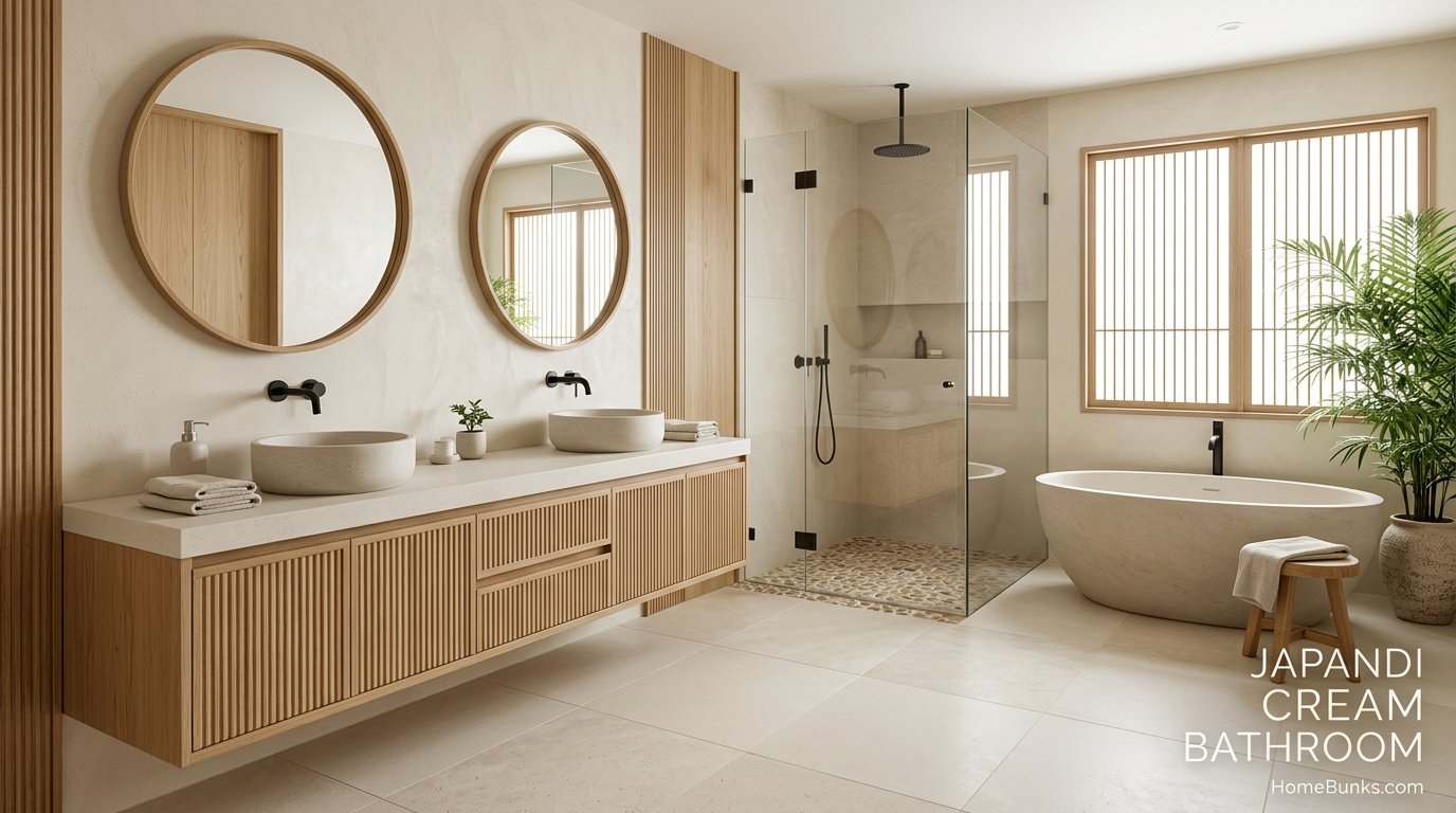
Wood is cream’s texture and depth in one material. Walnut gives the deepest contrast, acacia and pine the lightest, breeziest feel.
Put wood where hands and eyes land: vanity, countertop, mirror frame, stool. Four wood moments are plenty; the cream does the rest.
Avoid stark white porcelain beside warm wood and cream. The white reads blue and harsh against both, a warning the brown and cream specialists repeat often.
Cream with brass and bronze
Satin or brushed brass is cream’s signature metal: the two warmths amplify each other without shouting. It is the hotel bathroom formula for a reason.
Oil rubbed bronze is the traditional depth note, reading almost as a dark brown neutral. It suits shaker cabinetry, marble and heritage shapes.
Use one metal as the lead and let the other appear, if at all, in a single accessory. Mixed warm metals at equal volume read as indecision.
Cream with black
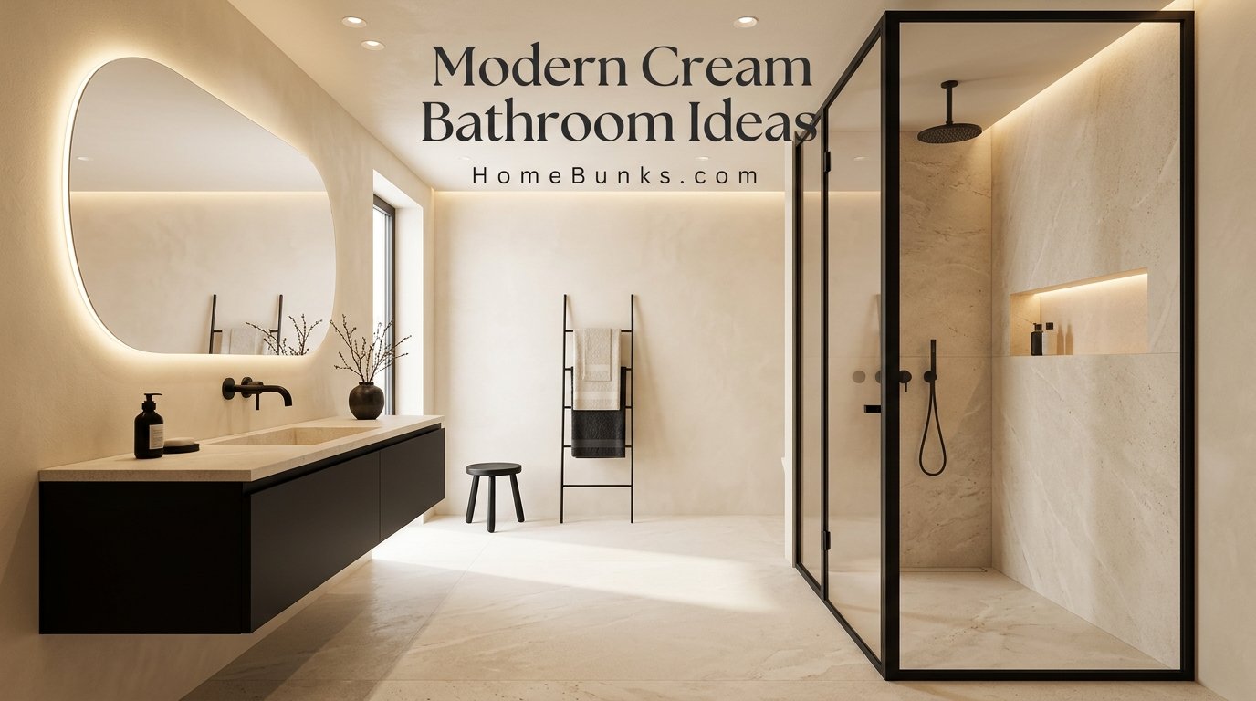
Black is cream’s modern anchor: a black vanity, black framed mirror, or black shower trim stops the palette drifting into sweetness.
Choose a softer black rather than the starkest available. Designers working this pairing specify softened blacks because pure black can glare against cream’s gentleness.
The site’s black and beige bathroom ideas shows how black behaves against the deeper beige members of this same family, if you want the contrast turned up.
Cream layered over beige
This is the tonal master combination: cream tiles with beige wall paint, or cream walls over beige flooring, depth stepping down as the eye travels.
Keep the steps visible but related, roughly one depth band apart. Two colors too close read as a matching mistake; too far apart breaks the calm.
For whole home flow, the same layering runs through the white and beige living room ideas, which uses the identical undertone discipline in a bigger room.
Cream with green and terracotta
Muted green is cream’s living accent: sage towels, an olive vanity, eucalyptus over the tub. The fully committed version lives in the site’s sage green bathroom ideas.
Terracotta and warm browns build the latte palette, the current social name for cream layered with wood and earth tones. It photographs beautifully and hides family life well.
Both accents obey one rule: muted versions only. Bright green or orange against cream cheapens the calm the palette exists to create.
Surfaces: Tile, Stone and Texture
In a cream room, texture does the work color refuses to do. Choose surfaces for their surfaces, not just their shade.
|
Surface |
Best cream choices |
Why it works |
|---|---|---|
|
Floor |
Travertine, limestone, terrazzo, warm wood look |
Movement hides daily life; flat cream does not |
|
Walls |
Paint, limewash look, part height tile |
The flexible layer, cheap to correct |
|
Shower |
Zellige style ceramic, gloss small format, stone |
Hand made variation or light return |
|
Vanity zone |
Marble, stone or wood countertop |
The most touched surface earns real material |
Floors and the grout rule
Honed and filled travertine is the classic cream floor: warm, matte, and comfortable underfoot, with its pits filled for easy cleaning.
The grout rule from tile specialists is simple: match the tile’s depth or go one shade deeper. Trade color names for this range include Alabaster and Biscuit tones.
On floors, choose mid tone grout even in cream schemes. Pale grout on a cream floor shows wear within months, a maintenance fact worth knowing before installation.
Walls, showers and the texture imperative
Here is the honesty the pretty photos skip: solid flat cream porcelain shows every hair and speck. Designers who work this palette say it plainly.
The fix is substitution, not effort: textured stone, terrazzo fleck, patterned ceramic or zellige style tiles hide daily debris the way solid surfaces never will.
In showers, gloss small format tiles return light and their many grout lines add grip and rhythm. On walls, one textured surface is enough; the rest can stay quiet.
If deep floors tempt you as the contrast instead, bathrooms with dark floors shows how they sit under light neutral walls before you commit.
Ideas by Style
Traditional and transitional cream
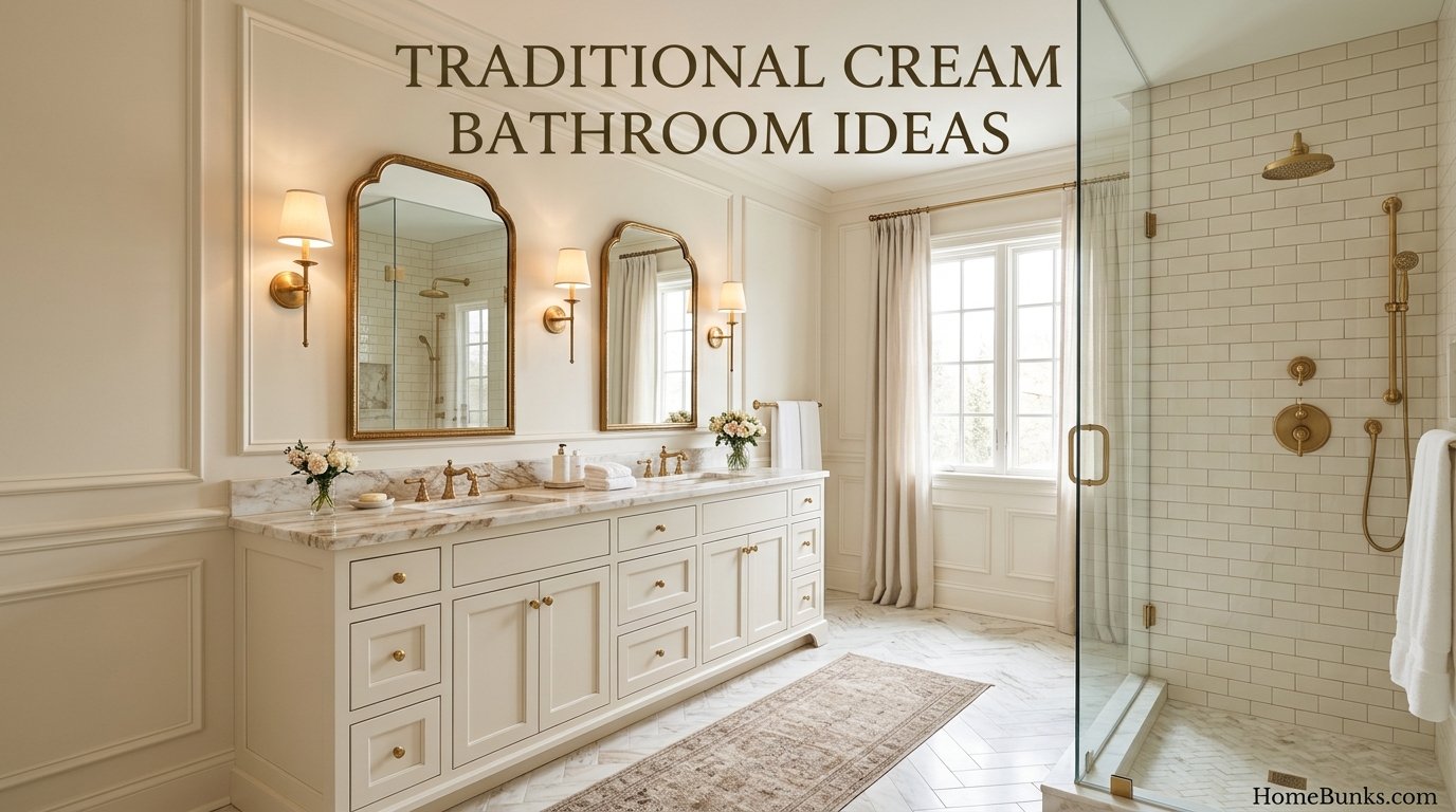
Cream is the native color of traditional bathrooms: marble, subway tile, shaker vanities, bronze or brass, picture frame molding on the walls.
Transitional rooms keep the materials and simplify the profiles: cleaner faucets, frameless mirrors, less carving, same warmth.
Modern organic and quiet luxury cream
Modern cream is editing plus texture: large format stone look tile, fluted glass, a walnut or black anchor, backlit mirrors, nothing ornamental.
Quiet luxury is the same room with better materials and fewer of them: real stone, unlacquered brass, thick towels, empty counters.
Cottage, farmhouse and coastal cream
Cottage cream runs soft and layered: beadboard, vintage style fixtures, woven baskets, floral or botanical art in warm frames.
Coastal cream is the brightest version: cream near white, pale woods, woven textures, blue green accents kept on a short leash.
Farmhouse cream swaps the black and white farmhouse contrast for warmth: cream walls, wood, black used as punctuation only.
Ideas by Room
Small bathrooms and powder rooms
Small rooms are cream’s home turf: near white brightness with warmth white cannot offer in a windowless box.
Color drenching in a classic cream, walls trim and ceiling together, removes the contrast lines that chop small rooms into pieces.
Add one texture and one anchor: terrazzo or patterned floor, black or walnut vanity, and the small room is finished, not decorated.
Primary bathrooms
Primary suites can run cream at full depth: Dove Wing range walls, marble or travertine, a freestanding tub as the room’s sculpture.
Layer the lighting here more than anywhere: ambient, mirror task, and one warm accent source, all in the 2700K to 3000K band.
Guest and family bathrooms
Guests read cream as clean and welcoming, the hotel signal, provided the light is warm and the towels are white or cream, never blue white.
Family rooms benefit from cream’s practical side: it hides grime better than white, suits every age, and refreshes with textiles instead of remodels.
The same warm palette logic in sleeping spaces is covered by the site’s cream bedroom ideas, useful if the ensuite and bedroom are being planned together.
Eight Copyable Cream Formulas
Systems are only useful attached to rooms. Each formula below names its cream depth, surfaces and anchor, ready to copy.
Formula 1: Classic hotel cream
Classic cream walls, marble or marble look surfaces, satin brass, white towels. The formula hotels use because it reads clean and warm in every light.
Formula 2: Latte organic
Cream walls, travertine and walnut, brushed brass, woven textiles. The brown and cream combination at full depth, warmest of the eight.
Formula 3: Cream and black modern
Light cream, black vanity and mirror, large format stone look tile, fluted glass. The contrast formula, with softer blacks keeping it gentle.
Formula 4: Drenched powder room
One classic cream on walls, trim and ceiling, arched mirror, stone topped vanity, warm sconces. Small, cocooning, and dramatic beyond its size.
Formula 5: Traditional bronze cream
Deeper cream, subway tile and marble, shaker vanity, oil rubbed bronze throughout. The heritage formula, built on profiles and materials.
Formula 6: Cream over beige tonal
Cream tiles, beige paint, warm wood, one brass story. The layering formula for readers calibrating between the two depths.
Formula 7: Coastal bright cream
Greek Villa range cream, pale woods, woven textures, sea glass accents used sparingly. The lightest formula, built for sun and small rooms.
Formula 8: Rental refresh cream
Verified cream paint where permitted, warm bulbs, warm white textiles, wood tray and stool, one plant, fixed tile untouched. Reversible, cheap, and surprisingly complete.
Pattern: Cream’s Energy Source
A palette this quiet borrows its energy from pattern, and cream takes pattern gracefully because nothing fights it.
Terrazzo fleck is the current favorite: movement, color hints and dirt camouflage in one surface, proven in small cream rooms by project after project.
Checkerboard with a warm stone partner is the traditional revival, strongest under shaker cabinetry and bronze hardware.
Herringbone floors and fluted surfaces (glass, cabinet fronts, tile) add rhythm without color, the modern organic signature.
Choose one pattern per room and let it be loud. Two patterns in a tonal room stop reading as calm and start reading as busy.
Storage That Keeps Cream Calm
Closed vanity storage protects the palette; open shelves in a cream room display every colored bottle like an exhibit.
A mirror cabinet in the room’s metal finish solves storage and light in one object, especially in the small rooms cream serves best.
Inside the shower, a niche tiled to match the wall disappears into the scheme. Products become the only color, and they are replaceable.
Styling and the Finishing Layer
Cream rooms are finished by objects, not colors. Style in three groups and stop, the same discipline the beige cluster uses.
Textiles first: towels in white or a second cream depth, a bath mat with texture, a woven basket doing visible storage work.
Wood and warmth second: a stool, a tray corralling the countertop, a plant with real green. These carry the room’s organic note.
One beautiful object third: a framed print, a stone soap dish, a good candle. Cream backgrounds flatter single objects the way gallery walls flatter art.
Keep counters nearly empty as a rule. In a tonal room, clutter reads louder than in any other palette, because nothing else competes with it.
Cream Through the Seasons
Cream is the easiest palette to re-dress: rust and olive textiles in autumn, fresh green and white in spring, the same bones in both photographs.
That flexibility is a financial feature, not just a styling one. The expensive layers stay fixed for a decade while the cheap layers follow taste.
It is also why cream holds up in listings year round. Stagers are not being lazy when they choose it; they are choosing the palette that argues with nobody’s furniture.
The Yellow Trap: Troubleshooting Cream
Cream’s one famous failure is turning yellow or sickly. It is almost always diagnosable, and the fix order matters, cheapest first.
Cause 1: The bulbs
5000K daylight bulbs are the top offender in warm schemes. Published designer guidance warns they wash out wood and can make cream walls look sickly green.
Fit 2700K to 3000K bulbs with CRI 90 or above before touching the paint. Half of all yellow cream complaints are lighting complaints in disguise.
Cause 2: Amplifying neighbors
Warm wood, terracotta and brass amplify cream’s yellow by reflection and contrast. A cream that behaved in the store can turn buttery beside a honey oak floor.
The correction is a grayed cream: White Dove’s muted pigment exists precisely for rooms full of warm neighbors.
Cause 3: Too much pigment for the light
Strong southern sun through warm materials, or a high pigment cream in a small room, overloads the color. Step one band lighter on the ladder, or choose the grayed option at the same depth.
Cause 4: The wrong white beside it
Blue white towels, grout or sanitaryware make cream look more yellow by contrast, the same way they make beige look dirty.
Swap the textiles to warm white or cream and retest the room before blaming the walls. Contrast creates color complaints that paint gets blamed for.
Lighting Rules for Cream Bathrooms
Temperature band: 2700K to 3000K, everywhere, no exceptions mixed in. One cool bulb in a warm scheme reads as a mistake, not a variety.
Layering: ambient ceiling light for the room, mirror height task light for faces, and one accent source for evening calm.
Mirrors do daylight work in windowless cream rooms. A backlit mirror adds the glow that makes cream read luminous instead of flat.
Natural light direction: north facing rooms are cream’s best argument, since its warmth compensates for gray light. South facing rooms can carry the deeper creams without darkening.
The Budget Ladder
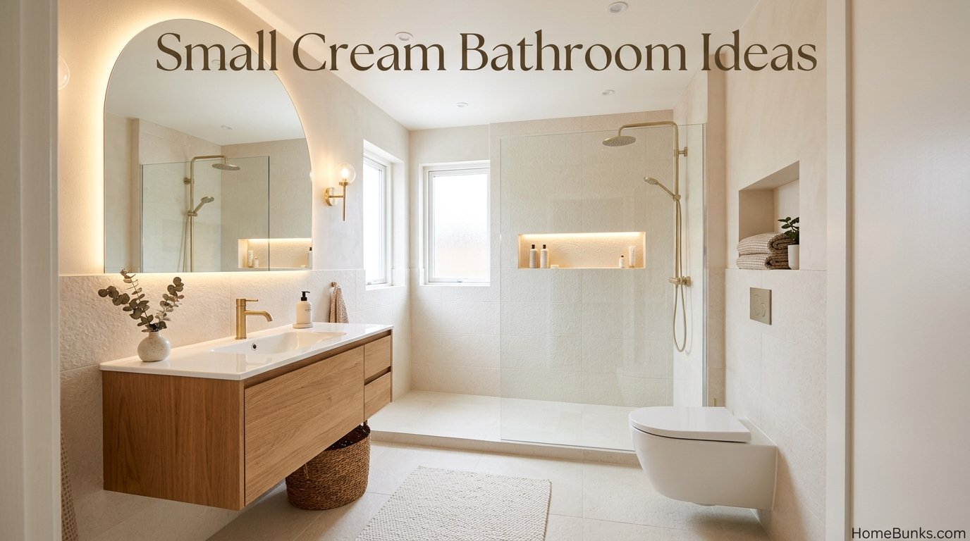
Cream reads at every budget, because its effect comes from undertone agreement, not from expensive materials.
Industry Cost vs Value reporting puts a midrange bathroom remodel at roughly 25,000 dollars in recent editions, a reported benchmark that anchors the top rung below.
|
Rung |
What changes |
Planning range |
|---|---|---|
|
Cream paint, warm bulbs, warm white textiles, wood accessories |
Hundreds to low thousands of dollars |
|
Vanity, mirror, brass or bronze fixtures, lighting |
Low thousands to around 10,000 dollars |
|
Tile, flooring, shower rebuild |
Around 10,000 to 25,000 dollars |
|
Layout change, real stone, freestanding tub |
25,000 dollars upward, benchmark anchored |
Rung 1 is the renter and seller move: a verified cream over builder white retemperatures the room, and everything else on the rung is reversible.
Rung 2 resets a sound room’s read entirely. Rung 3 is where the texture imperative from the surface section earns its money.
Rescue: Updating a Dated Cream Bathroom
Dated cream is a real category: flat cream, chrome everywhere, no texture, the 2000s default that gave the color an unfair reputation.
The color was never the problem. Work the ladder in order; most rooms are rescued by rung 2.
Rung 1: Fix the light and textiles
Warm bulbs in the correct band, warm white or cream towels, one wood accessory. The room already looks younger.
Rung 2: Change the metal story
Replace chrome with one repeated warm finish, satin brass for glow or oil rubbed bronze for depth, across faucets, pulls and mirror frame.
Rung 3: Break the flatness
Add one textured surface: a zellige style backsplash, a limewash look wall, or a terrazzo floor mat zone in a full retile later.
Rung 4: Add the anchor
One black or walnut piece, usually the vanity or mirror, gives the tonal room its missing full stop.
Rung 5: Repaint inside the ladder
If the cream itself leans yellow or pink, move one step on the depth ladder or switch to a grayed cream at the same depth, rather than jumping to white or gray.
Mistakes That Flatten Cream Bathrooms
Daylight bulbs are mistake one, and the only one that can make a good cream look ill. Check the Kelvin before anything else.
One shade everywhere is mistake two. Cream needs three depths (walls, textiles, a deeper wood or tile layer) or it becomes the flat dated version.
Solid flat porcelain is mistake three, a maintenance trap dressed as minimalism. Texture is how cream rooms stay looking clean.
Blue white anything is mistake four: towels, grout, ceilings or fixtures with cool casts fight the palette and manufacture yellow complaints.
Ignoring fixed fixtures is mistake five. Stark white sanitaryware is a fixed neighbor; choose the cream’s undertone against the actual porcelain, not a brochure.
Skipping the day long sample is mistake six. Cream is the most light sensitive neutral in the family; an hour of testing is not enough.
Frequently Asked Questions
Is cream a good color for a bathroom?
Yes. Cream gives the brightness of white with warm undertones that feel calmer and more forgiving, hiding grime better than stark white and flattering skin at the mirror.
What is the difference between cream and white in a bathroom?
White is neutral to cool and reflects light flatly. Cream carries yellow based warmth, reading softer and cozier, and it pairs with brass, bronze and warm woods that fight with blue whites.
What is the difference between cream and beige?
Depth. Cream paints sit at LRV roughly 74 to 89, near white. Beige sits lower, roughly 40 to 65, as a mid tone. Cream is the light layer, beige is body color, and the two layer together naturally.
What colors go with cream in a bathroom?
Warm woods, brass and bronze, black as an anchor, beige as the deeper layer, warm browns, muted greens and terracotta. Cream’s warmth decides the guest list: cool blues and blue whites clash first.
What is the best cream paint for a bathroom?
The most specified are Swiss Coffee OC-45 (LRV 82), White Dove OC-17 (about 83) and Alabaster SW 7008 (LRV 82), with Dove Wing OC-18 (LRV 74) as the deeper option. Sample in your light before choosing.
Why does my cream bathroom look yellow?
Usually bulbs or light. Warm bulbs outside their intended band, strong sun through warm wood, or a cream with too much yellow pigment for the room all push cream toward yellow. Check the light first, the paint second.
What light bulbs suit a cream bathroom?
2700K to 3000K warm white, CRI 90 or above. Designer guidance for warm schemes warns that 5000K daylight bulbs wash out wood and can make cream walls look sickly green.
What grout color works with cream tiles?
Match the tile’s depth or go one shade deeper. Tile trade naming for cream grouts includes Alabaster and Biscuit tones, and mid tone grout on floors hides wear that light grout shows within months.
Should fixtures be white or cream with cream walls?
Either can work if undertones agree. Stark white sanitaryware against deep cream can read blue; warm whites sit calmly. Test the actual fixture against the actual paint chip, because porcelain whites vary by maker.
Does cream make a small bathroom look bigger?
Yes, cream is near the top of the light scale while feeling warmer than white. Terrazzo and textured surfaces help further by breaking up the field so the eye reads space rather than edges.
What metal finishes suit cream bathrooms?
Satin and brushed brass for warmth, oil rubbed bronze for traditional depth, chrome carefully in cooler creams, and matte black as the modern anchor. Warm creams flatter warm metals most.
Can cream bathrooms look modern?
Yes, with editing: large format tiles, fluted glass, a black or walnut anchor, frameless shower glass and restrained accessories. Cream plus clean lines reads warm minimalism rather than tradition.
Is a cream bathroom timeless or dated?
The palette is timeless; the 2000s execution dated. Flat cream with chrome and no texture is the dated version. Cream with stone texture, warm metals and layering is the current one, and they are different rooms.
What flooring suits a cream bathroom?
Travertine and limestone for authenticity, marble and marble looks for traditional luxury, terrazzo for pattern energy, and warm wood looks for organic schemes. Solid flat cream porcelain shows every speck, which designers flag openly.
How do I stop an all cream bathroom looking boring?
Texture and one anchor. Textured stone or patterned ceramic instead of solid porcelain, three depths of cream, warm wood, and one deep note such as a black vanity or bronze fixtures.
Can I mix cream and beige in one bathroom?
Yes, it is the classic tonal pairing: cream tiles with beige wall paint, or cream walls with beige flooring. Keep the undertone family shared and the depth steps visible.
What is color drenching in a cream bathroom?
Walls, trim, ceiling and sometimes cabinetry in one cream family, removing contrast lines so small rooms feel cocooned and larger. Off whites like White Dove are commonly specified for exactly this all over use.
What ceiling color goes with cream bathroom walls?
The same cream for drenched or low rooms, or a warm white one step lighter for standard rooms. Blue white ceilings are the classic clash to avoid.
Is cream good for a windowless bathroom?
Yes, with light creams, layered warm lighting and mirrors. Cream keeps the warmth that stark white loses under artificial light, which is why it outperforms white in interior bathrooms.
What vanity color works in a cream bathroom?
Warm woods lead (walnut for depth, acacia and pine lighter), black for modern contrast, deep green as the designed note, and cream on cream for drenched traditional rooms.
Does cream hide dirt better than white?
Designers say yes for daily grime and hair, especially with textured or patterned surfaces and mid tone grout. It shows less than white and less than very dark floors, a practical middle.
What towels and textiles suit cream bathrooms?
White for hotel freshness, cream in a second depth for tonal calm, warm browns and rust for autumn weight, sage for the living note. Keep to two depths per set.
Can cream work in a family bathroom?
Very well. It hides wear, suits all ages, reads clean without feeling clinical, and refreshes with textiles as children grow.
What is the latte palette in bathrooms?
The current social name for cream layered with warm browns, from walnut and travertine to terracotta. It is the cream and brown combination with better marketing, and it photographs exceptionally well.
How do I update a dated cream bathroom?
Change the signals around the color: warm bulbs, one warm metal repeated, a wood element, textured textiles, and one anchor piece. The rescue is usually accessories and lighting, not demolition.
Cream or gray for a bathroom in 2026?
Cream and warm neutrals lead the current cycle; gray suits cooler, tailored briefs and chrome heavy homes. Cream wins on warmth and resale breadth in most US homes right now.
Should I use cream in a north facing bathroom?
Yes, it is one of its best uses. Cream’s warm undertone compensates for cool northern light that turns white bathrooms gray and flat.
Is Swiss Coffee too dark for a small bathroom?
At LRV 82 it is a light color and works in small rooms with adequate lighting. In very dark interior rooms, step lighter toward Greek Villa territory and add mirror light.
What is Dove Wing and when should I use it?
Dove Wing OC-18, a deeper warm cream at LRV 74. Use it when the classic creams wash out in bright rooms, or for cabinetry and lower walls needing more body.
Does cream work with chrome fixtures?
Carefully. Chrome is cool; deep warm creams can clash with it, while grayed creams like White Dove tolerate it. If chrome is fixed, choose a cream with a grayed undertone and test them together.
How many shades of cream should one bathroom use?
Three depths is the working rule: walls, a lighter textile layer, and a deeper wood or tile layer. One shade everywhere is the flat dated version.
Is cream a good choice before selling a home?
It is one of the safest. Cream reads clean, warm and current to the widest buyer pool, photographs softly, and lets buyers imagine their own accents.
What backsplash suits cream tiles?
The same tile continued for calm, zellige style ceramic for hand made texture, or marble for traditional rooms. Keep the grout logic consistent with the floor choice.
Can I paint bathroom cabinets cream?
Yes, cream cabinetry is a traditional staple and a current warm minimalism move. Use a durable cabinet rated finish, and consider a deeper cream like Dove Wing for body.
What is the difference between ivory and cream?
Ivory is the lightest, least yellow member of the family; cream carries more visible yellow warmth. On actual chips, LRV and undertone matter more than the name.
What mirror suits a cream bathroom?
Arched for softness, round for modern organic, framed in the room’s metal for traditional, frameless for minimal schemes. The mirror is usually the cream room’s main shape event.
Can cream bathrooms feel luxurious?
Yes, through materials and restraint: real or convincing stone, unlacquered or brushed metals, thick towels, layered warm light and nearly empty counters. Luxury in cream is quiet, the hotel formula.
What is the easiest cream bathroom idea to copy first?
The rental refresh formula: verified cream on the walls where permitted, warm bulbs, warm white textiles, a wood stool and one plant. It teaches you your light before any bigger spend.
Quick Start: Your First Five Decisions, in Order
Decision 1, depth. Pick your band on the ladder: deeper creams for bright rooms and cabinetry, classics for everything else.
Decision 2, undertone check. Hold the swatch against your fixed tile and porcelain for a full day. Grayed creams for warm heavy rooms, warm creams for cool light.
Decision 3, bulbs. 2700K to 3000K, CRI 90 plus, throughout. This decision rescues more cream rooms than any paint change.
Decision 4, texture. Choose the one surface that carries texture or pattern. Flat cream everywhere is the dated version, whatever the paint.
Decision 5, anchor and metal. One metal story, one deep piece. With those set, the room can be styled in an afternoon and finished.
Conclusion
Cream bathroom ideas succeed on one insight: brightness does not have to be cold. Cream keeps white’s light and adds the warmth that makes a bathroom feel like a room, not a clinic.
Choose by depth first, undertone second, light the room in the warm band, give surfaces texture, and let one anchor supply the contrast.
Do those five things and cream stops being the safe option. It becomes the timeless one, the palette that still looks right when the trend cycle has moved twice more.
For the rest of the home in the same warm neutral family, explore the HomeBunks home ideas library and its other color led guides.