
Lavender bathroom ideas succeed or fail on one hidden variable: undertone. The same color family reads serene in one bathroom, babyish in a second, and plain gray in a third, and light decides which.
So this page starts with the three lavenders, not with photographs. Blue leaning, pink leaning, and gray leaning lavender each have their own safe whites, metals, woods, and stones, and mixing the teams is the classic mistake.
Then come the tools: a paint table ordered by LRV with every figure’s source labelled, a sampling method that takes two days, a pairing rulebook, and a commitment ladder from towels to tile.
The ideas themselves fill the second half: powder rooms, small baths, guest baths, kids baths, and primary suites, each built on a stated lean so you can copy the logic, not just the look.
The Three Lavenders: Pick Your Lean First
Blue leaning lavender is the cool, crisp branch. It sits near periwinkle, pairs with Carrara marble and chrome, and risks reading icy or clinical in north light or beside blue white trim.
Pink leaning lavender, the lilac direction, is the warm, romantic branch. It pairs with cream, blush, brass, and travertine, and risks reading sweet or nursery like when it is saturated and surrounded by more pink.
Gray leaning lavender is the muted, architectural branch. It behaves almost like a neutral, pairs with pale gray, brushed nickel, and white oak, and risks collapsing into ordinary gray in windowless rooms.
|
Lean |
Character |
Safe Partners |
Main Risk |
|---|---|---|---|
|
Blue leaning |
Cool, crisp, spa like |
Carrara marble, chrome, crisp white |
Reads blue or icy in north light |
|
Pink leaning |
Warm, romantic, soft |
Cream, blush, brass, travertine |
Reads sweet or nursery like |
|
Gray leaning |
Muted, modern, neutral adjacent |
Pale gray, nickel, white oak |
Collapses to plain gray without daylight |
Every later section assumes you know your lean. If you do not, the sampling method below finds it in two days, and no paint should be bought before that test is done.
Benjamin Moore’s own purple guidance makes a pairing point worth borrowing here: pastel purples ground well with greens. That is the gray and pink leans’ bridge to sage, and it returns in the pairing rulebook.
The Paint Table, Ordered by LRV
LRV, light reflectance value, runs from 0 for black to 100 for white and predicts how bright a color will feel on the wall. In small and windowless bathrooms, LRV is the most useful number on this page.
Each figure below carries its source in the same row, because paint numbers in this topic circulate without provenance. Blog reported figures are labelled as reported; nothing here is presented as manufacturer certified unless the source says so.
|
Paint |
Lean |
LRV |
Source and Note |
|---|---|---|---|
|
Benjamin Moore Dreamy Cloud 2117-70 |
Pale blue gray |
76 |
Per Kylie M Interiors’ purple paint analysis; brightest option, can wash out in strong south light |
|
Benjamin Moore Abalone 2108-60 |
Pale gray |
62 |
Same analysis; the subtle, neutral adjacent pick |
|
Sherwin Williams Euphoric Lilac SW 6835 |
Pink leaning |
About 61 |
Per Wild Fox Painting’s color card, labelled approximate there |
|
Sherwin Williams Rhapsody Lilac SW 6828 |
Light lilac |
60.01 |
|
|
Benjamin Moore French Lilac 1403 |
Warmer, more colorful |
56 |
Per the same paint analysis; holds its color in cool north light |
|
Benjamin Moore Lavender Lipstick 2072-50 |
Deeper, warmer |
43.82 |
Per the same comparison data; the depth option for vanities and powder rooms |
One deliberate omission: Benjamin Moore Lavender Mist 2070-60 is widely described as cool with a blue violet undertone and a gray cast, and it belongs on any finalist list. No LRV is printed for it here because none was verified from a reliable source for this article.
Read the table as a depth ladder. Walls in full bathrooms usually live between LRV 55 and 76. The 40s belong on vanities, wainscot, and powder room walls, where depth is a feature instead of a light problem.
Two shades at the same LRV can still behave differently, because LRV says nothing about undertone. That is why the table’s lean column matters as much as its number column, and why sampling is not optional.
The Sampling Method: Poster Board, Three Lights, Two Days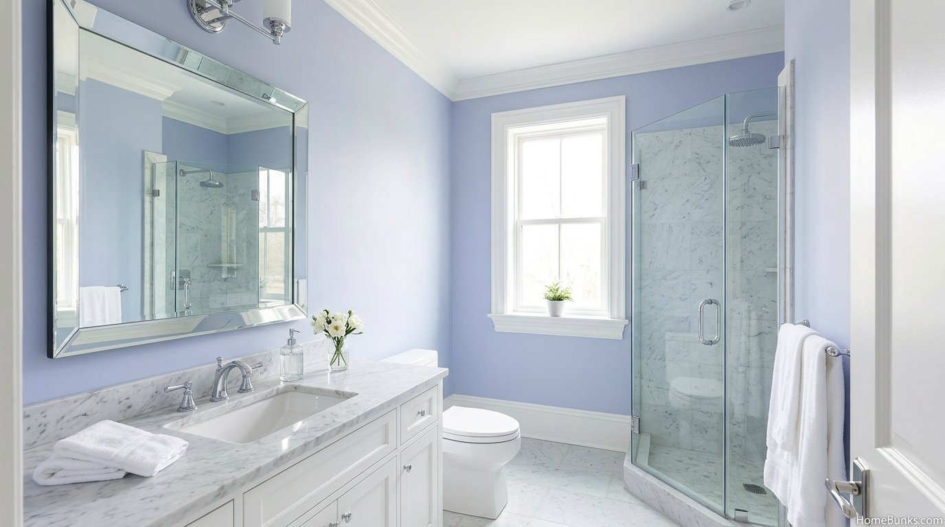
1. Paint big samples on primed poster board. Not small wall patches. Boards move, and a lavender that charms beside the window may turn blue beside the tub. Working designers recommend exactly this method for purples.
2. Check three lights. Morning daylight, midday, and evening under the actual bathroom bulbs. Lavender is the most light sensitive pastel in common use; store lighting is the least representative light it will ever meet.
3. Place boards against fixed surfaces. The tub, the tile, the floor, and the vanity wood are not changing. The paint must join their team, and the board test shows clashes while they are still free to fix.
4. Live with finalists for two days. Purple perception shifts as your eye adapts. The shade that looked daring on day one often reads calm on day two, and the reverse happens with shades that lean too pink.
5. Test the trim beside it. Half of all lavender disappointments are white disappointments: a crisp blue white makes pink lavender look dirty, and a creamy white makes blue lavender look neon. Sample the white on the same board’s edge.
Peel and stick swatches are the tidy alternative to boards and work well for renters testing a vanity color. The rules do not change: three lights, fixed surfaces, two days.
The Pairing Rulebook, by Lean
Pairings fail when the lean is ignored. This rulebook assigns each partner to the lean it actually suits, which is the table the photo galleries never print.
|
Partner |
Blue Leaning |
Pink Leaning |
Gray Leaning |
|---|---|---|---|
|
White |
Crisp white |
Warm white, cream |
Either, test both |
|
Metal |
Chrome, polished nickel |
Brass, brushed gold |
Brushed nickel, matte black accents |
|
Stone |
Carrara marble |
Travertine, warm marble |
Pale concrete look, light gray stone |
|
Wood |
White oak, ash |
Walnut, warm oak |
White oak, pale woods |
|
Second color |
Pale blue, navy accents |
Blush, sage |
Sage, black, charcoal |
Whites do the most damage when mismatched. As a starting point, crisp whites suit cool lavenders and warm whites suit pink ones; the cream ladder in cream bathroom ideas shows how warm a white can go before it turns yellow.
Metals follow temperature. Chrome and nickel extend the cool leans, brass warms the pink lean, and matte black outlines any lean in small doses. The metal logic in green and gold bathroom ideas, one dominant finish with one supporting finish, applies unchanged.
Stone is the quiet decider. Carrara’s gray veining lives inside the cool family, which is why the lavender and marble photograph repeats everywhere. Warm lavenders deserve warm stone for the same reason.
Second colors should enter at textile scale first. Sage is the safest, because muted green and muted purple calm each other; the full sage treatment lives in sage green bathroom ideas for readers who want the green to lead instead.
Blush is the pink lean’s partner color, and the two pastels together get a full treatment in pink and green bathroom ideas, where pink leads and green supports. Here pink supports and lavender leads; the discipline is the same.
The Commitment Ladder: Textiles, Vanity, Walls, Tile
Lavender has a natural commitment ladder, and most readers should enter one rung below the one they are imagining. Each rung is complete on its own; none requires the next.
Rung 1: Textiles and accessories. Towels, a bath mat, a shower curtain, a soap set, framed prints, dried lavender. A weekend, fully reversible, and the only rung renters need. Keep lavender near a third of the visible color.
Rung 2: The painted vanity. One object, one quart of paint, the room’s entire color story. Lavender cabinetry with a white counter is the hero combination in The Creatives Hour’s purple bathroom collection, repeated with brass and gold hardware.
Rung 3: Walls. The full envelope at pale depth. Choose a bathroom formulated paint in matte or satin; Benjamin Moore positions its Aura Bath and Spa line for humid rooms. This rung demands the sampling method, no exceptions.
Rung 4: Tile. Subway, hex, or mosaic lavender tile on one surface, usually the shower or a backsplash, with quieter walls around it. Tile outlives trends, so this rung belongs to readers certain of their lean.
Rung 5: Color drenching. Walls, trim, and ceiling in one lavender family, a step lighter on the ceiling. Powder rooms and small baths carry drenches best; the effect is an envelope, not a theme, when the depth stays pale.
Room Plays: Five Bathrooms, Five Lavender Logics
The Powder Room: Depth Is Allowed
Powder rooms are small, windowless or nearly so, and visited briefly, which makes them the one room where deeper lavender is a feature. Lavender Lipstick depth on walls, a pedestal sink, and brass or black accents is the classic play.
The mirror over pedestal sink ideas page helps here, because a powder room’s mirror is its largest reflective surface and its main light multiplier. Choose the mirror finish to match the lean’s metal, not the faucet’s leftovers.
The Small Bathroom: LRV Does the Work
Small full baths need LRV 60 and above on walls, a pale floor, and lavender discipline: one surface colored, everything else quiet. The airy schemes in the galleries are all built this way, whatever their captions claim.
Vanity space is the other small room battle, and the layouts in double vanity ideas for small bathrooms show how much storage a small footprint can hold. A lavender vanity under a white counter keeps the color and the function in the same square foot.
The Guest Bathroom: Calm, Clean, Liked by Everyone
Guest baths reward the safest lavender: gray leaning or pale blue leaning, white towels, good mirror light, and one living or dried plant. Guests forgive almost any color except the one that makes their skin look strange in the mirror.
That mirror test is practical, not vain. Lavender casts a slight color onto skin; 2700K to 3000K bulbs and a neutral white sink zone keep faces looking like faces, which is the real guest bathroom standard.
The Kids Bathroom: Mid Pale and Wipeable
Kids baths take mid pale lavender in a satin or bathroom grade finish, with the whimsy carried by replaceable textiles. Keep characters and themes out of tile and paint, because children outgrow them years before the surfaces wear out.
Splash height matters more than style here. The palest shades show every toothpaste mark at sink level; a slightly deeper wainscot or tile splash zone under a pale wall is the parent tested compromise.
The Primary Bathroom: Cohesion With the Bedroom
Primary suites should borrow the bedroom’s temperature. A pink leaning lavender bath beside a warm bedroom flows; a blue leaning one beside the same bedroom jars at the doorway. The bath does not need to match, only to agree in temperature.
Freestanding tubs and long vanities give primary baths two natural color carriers, tub surround and cabinetry, so walls can stay warm white while lavender works at furniture scale. It is rung 2 thinking at a larger budget.
Surfaces: Tile, Wallpaper, Wainscot and Floors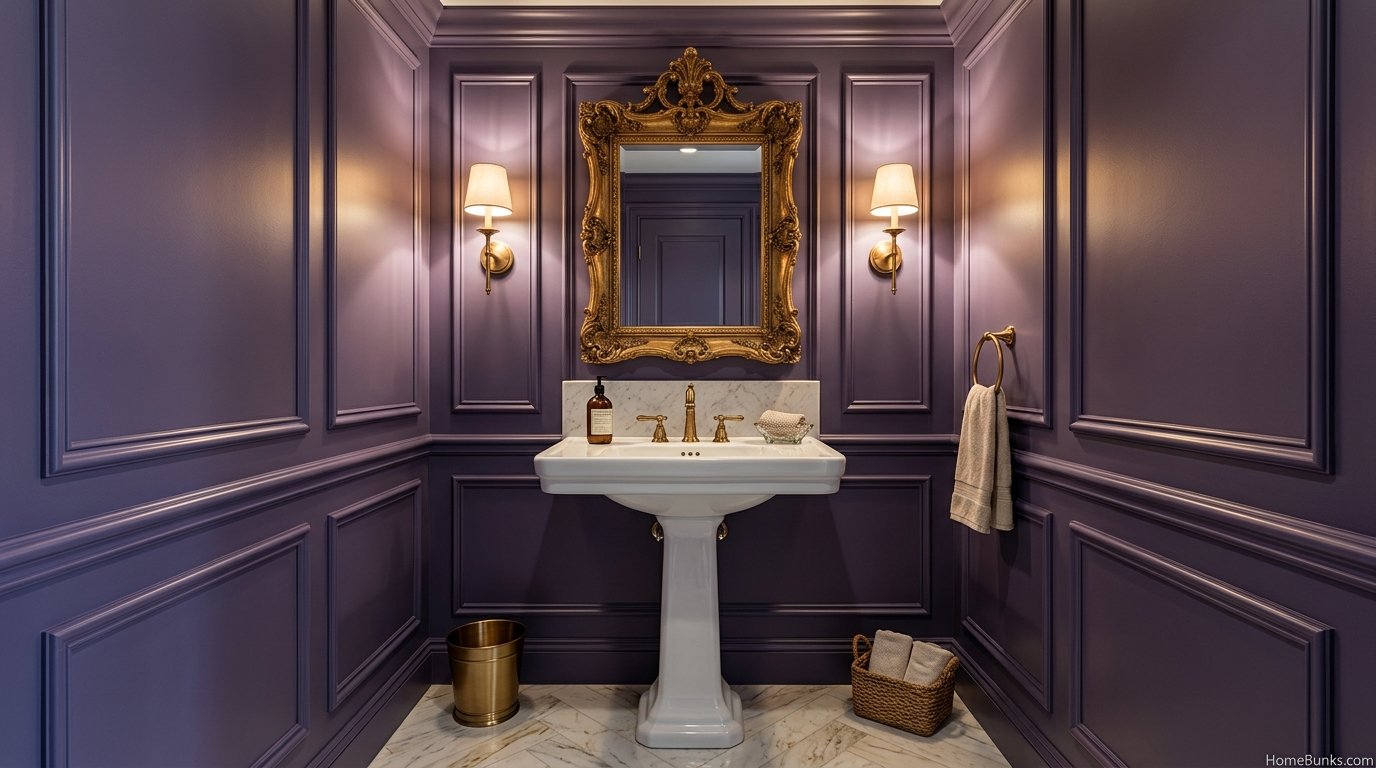
Tile is lavender’s most permanent surface, so formats stay classic: subway for modern and cottage rooms, hex for vintage ones, mosaic for shower floors and niches. Glazed ceramic shifts with light angle, so view samples wet and dry before ordering.
Grout decides whether lavender tile looks tailored or tired. Light gray grout is the professional default for pale tile. Treat claims about tinted purple grout, including warnings that it yellows, as unverified trade talk until a manufacturer source backs them.
Wallpaper suits powder rooms and low splash zones: floral and botanical lavender papers carry the vintage and cottage schemes. In full baths, choose vinyl or washable rated papers, and remember that ventilation decides lifespan more than brand does.
Wainscot and board and batten split the room’s work: lavender below at wainscot height, warm white above. The split flatters small rooms, protects the color from splash zones, and gives traditional rooms their architecture.
Floors stay quiet under lavender walls: pale gray or white tile, marble look porcelain, or white oak tones in wood look tile. The strong pattern exception is a black and white floor, whose graphic discipline comes from black and white bathroom ideas.
Dark floors reverse the scheme entirely, lavender above and depth below, and bathrooms with dark floors covers that family’s lighting rules. The pairing works when the lavender is pale and the floor’s tone is warm or neutral, not blue black.
Style Directions: Vintage, Cottage, Modern, Farmhouse
Vintage and Victorian is lavender’s ancestral home. Clawfoot tub, pedestal sink, hex floor, floral paper, and a pink leaning shade make the period scheme, and lavender genuinely was a period color rather than a modern invention.
Cottage and French country take the pink lean softer: cream walls with lavender textiles, dried lavender in a jug, painted furniture, and imperfect handmade look tile. The small cabin bathroom ideas page shows the small rustic bones this style borrows.
Modern pastel takes the gray lean structural: frameless mirrors, matte black or chrome, one patterned tile maximum, and no florals. The Coolist’s 2026 purple coverage pairs light lavender with pale cabinetry exactly this way.
Farmhouse meets lavender at shiplap and wainscot, with black fixtures as the outline. It works when the lavender is gray leaning; sweet pink lavender plus farmhouse signs and slogans tips the room into theme territory.
Cool coastal is the blue lean’s other home: lavender treated as a softer blue, beside white and pale wood, in the same spirit as blue and white bathroom ideas but warmer at the edges. It suits bright rooms with real daylight.
Lighting: The Color’s Second Ingredient
Lavender is two colors: the one your bulbs show and the one daylight shows. Bulbs at 2700K to 3000K keep all three leans balanced; cooler bulbs push lavender blue and clinical, dim warm bulbs push it muddy.
Layer the light as the room deepens. Pale lavender survives on one good ceiling light and mirror light. Deeper lavender, the powder room play, needs layers: sconces at face height, a ceiling source, and no single bare bulb doing everything.
North facing rooms gray and cool every color, lavender fastest. The counter is a warmer, slightly more saturated sample: French Lilac’s LRV 56 with its warmer cast holds identity in cool light better than paler, icier shades, per the paint analysis cited in the table.
Windowless rooms are a bulb only environment, so the sample test must happen in the room, lights on, door closed. Gray leaning lavender is the risk here; add white contrast at trim and fixtures so the eye can still find the purple.
Lavender vs Lilac vs Purple: The Depth Table
These names describe one family at different depths and leans, and choosing between them is a numbers decision before it is a taste decision.
|
Name |
Typical Depth |
Lean |
Best Bathroom Use |
|---|---|---|---|
|
Lavender |
Pale to light, LRV roughly 55 to 76 |
Blue or gray |
Full walls, small baths, long term rooms |
|
Lilac |
Light to mid, LRV roughly 45 to 65 |
Pink |
Vanities, powder rooms, romantic schemes |
|
Purple |
Mid to deep, below LRV 45 |
Either, saturated |
Accents, one wall, replaceable items |
Use lavender where the room must stay bright for a decade. Use lilac where warmth and personality can lead. Keep true purple at accent scale unless the room is a deliberate statement with the light to support it.
Mistakes and Fixes
- Buying from the store swatch. Store light lies for lavender more than for any neutral. Fix: poster board samples, three lights, two days, beside fixed surfaces.
- Mismatched white trim. Blue white beside pink lavender, cream beside blue lavender. Fix: choose the white from the lean’s team and sample them together.
- Three purples, three undertones. Walls, towels, and tile each leaning differently. Fix: pick one lean and demote the rebels to another room.
- Saturated purple at full scale. Every surface competing. Fix: the 60 30 10 frame, roughly 60 percent neutral, 30 percent lavender, 10 percent accent, with pale full walls as the stated exception.
- Ignoring the floor’s temperature. Honey oak and yellow pine amplify purple because yellow is its complement. Fix: test the vanity and floor woods against the sample, and lean on white oak, ash, or walnut.
- Painting before choosing bulbs. The bulbs are half the color. Fix: finalize 2700K to 3000K lighting first, then sample under it.
- Repeating viral statistics. Claims that lavender cuts stress by a precise percentage circulate in this topic without a verifiable source. Fix: enjoy the color as design tradition, and let no number into the room that cannot be sourced.
More Bathroom Ideas on HomeBunks
The warm side of this color family lives in beige bathroom ideas, whose undertones lavender must agree with when the two palettes share a hallway or a suite.
For the full color library, from cool pastels to deep jewel tones, homebunks.com collects every bathroom scheme on the site in one place.
Frequently Asked Questions
Is lavender a good color for a bathroom?
Yes, for most bathrooms. Pale lavender is light enough to keep small rooms bright, reads calm beside white fixtures, and sits in the pastel family designers use for spa schemes.
The condition is undertone control: pick the blue, pink, or gray lean deliberately, because the wrong lean is the main failure mode.
What is the difference between lavender and lilac?
In paint practice, lavender leans slightly blue and gray, while lilac leans slightly pink and warm.
Product names blur the line, so judge by the swatch in your own light, not the name. The distinction matters because it predicts which whites, woods, and metals will sit comfortably beside the color.
What colors go with lavender in a bathroom?
Crisp and warm whites, pale gray, Carrara marble, chrome and brushed nickel for cool schemes; cream, blush, sage, and white oak for warm schemes; brass and gold when the lavender leans pink. Black works as a small graphic accent. The undertone of the lavender picks the team.
What is the best lavender paint color for a bathroom?
There is no single best, but the shortlist by lean is: gray leaning Benjamin Moore Lavender Mist 2070-60, Sherwin Williams Rhapsody Lilac SW 6828 at LRV about 60, deeper Lavender Lipstick 2072-50 at about 44, and pale Dreamy Cloud at LRV 76. Sample all finalists in the room.
Does lavender make a small bathroom look bigger?
Pale, higher LRV lavenders reflect more light and can make a small bathroom feel airier, the same mechanism as any light color.
LRV is the number to compare: Dreamy Cloud at 76 reflects far more light than Lavender Lipstick at about 44. Deep lavender does the opposite and belongs in powder rooms.
Why does my lavender paint look blue?
Because many lavenders carry a blue violet undertone, and cool light, north facing windows, and blue white trim all push it bluer.
Benjamin Moore’s Lavender Mist 2070-60 is a cool example. The fixes are a pinker or grayer lavender, warmer bulbs at 2700K to 3000K, and a warm white trim.
Why does my lavender look pink or Barbie?
The color likely leans red, the room light is warm, or the surrounding whites are creamy, each pushing perception toward pink.
Saturated mid tone lavenders are the usual culprits. Move toward a gray leaning lavender, raise the LRV, and check the sample beside the actual tub and tile before committing.
Why does lavender look gray and dull in my bathroom?
Cool north light desaturates lavender, and gray leaning shades in windowless rooms can collapse into plain gray.
The fixes are more light, warmer bulbs, a slightly more saturated sample, and white contrast at the trim and fixtures so the eye can find the purple. Sampling on poster board at different times of day is the standard diagnostic.
What white paint goes with lavender walls?
Match the white to the lavender’s lean. Cool blue leaning lavender pairs with a crisp white such as Benjamin Moore Chantilly Lace.
Warm pink leaning lavender pairs with a soft warm white such as White Dove or Sherwin Williams Alabaster. A mismatched white is the fastest way to make lavender look dirty or neon.
Should lavender bathroom walls be matte or satin?
Use a bathroom specific paint in matte or satin formulated for humidity, such as Benjamin Moore’s Aura Bath and Spa line positioning.
Traditional flat paints struggle with steam and splashes. Satin wipes cleaner around sinks and tubs; dedicated bathroom matte finishes are engineered to handle moisture while keeping the soft look.
Can I use lavender tile instead of paint?
Yes, and tile is the higher commitment version of the same idea. Lavender subway, hex, or mosaic tile works best as one surface, typically the shower or a backsplash, with quieter walls elsewhere.
Glazed ceramic shifts color with light angle, so view the tile sample wet and dry, morning and evening, before ordering.
What metal finish works best with lavender?
Cool lavenders pair naturally with chrome and brushed nickel. Warm and pink leaning lavenders pair with brass and brushed gold, the combination lifestyle galleries repeat most.
Matte black gives lavender a modern graphic edge. Mixed metals are fine when one finish dominates and the other appears once or twice.
Does lavender go with marble?
Very well. Carrara marble’s gray veining sits inside lavender’s cool family, and the pairing is the most repeated luxury scheme in competitor galleries.
Warm lavenders can fight cool marble slightly; keep the marble pairing for blue and gray leaning lavenders, and use travertine or warm stone for pink leaning ones.
What wood tones work with lavender?
White oak and ash flatter cool lavenders; walnut warms mid tone lavenders; honey oak and yellow pine are the risky pairings because yellow and purple are complementary and amplify each other.
One competitor guide makes the same pine warning. Test the vanity wood against the paint sample, not against a photograph.
How do I add lavender to a bathroom without painting?
Textiles and accessories first: towels, a bath mat, a shower curtain, a soap set, framed prints, and dried lavender.
This is the commitment ladder’s first rung and the renter friendly route. Keep the lavender share near a third of the visible color so the room reads styled, not themed.
Is a lavender bathroom dated or timeless?
Pale gray leaning lavender dates slowly because it behaves like a neutral; saturated 1990s purple dates fast.
Design coverage in 2026 treats purple bathrooms as a current trend at the deep end and a classic at the pale end. Choose pale for walls you will keep a decade, and put trendy depth in replaceable items.
What is color drenching and can lavender do it?
Color drenching paints walls, trim, and often the ceiling in one color family for an enveloping effect.
Lavender drenches well in powder rooms and small baths because the color is soft at pale depths. Use one shade on walls and a step lighter on the ceiling to keep the envelope from feeling like a lid.
Can lavender work in a modern bathroom?
Yes, with structure: gray leaning lavender, matte black or chrome hardware, a frameless mirror, and minimal pattern. The Coolist’s 2026 purple coverage pairs light lavender with pale cabinetry and patterned tile in modern schemes. Modern lavender fails when it accumulates frills, florals, and multiple purples at once.
Can lavender work in a vintage or Victorian bathroom?
It is historically at home there. Lavender and lilac were period colors, and they suit clawfoot tubs, pedestal sinks, hex tile floors, and floral wallpaper, the combination The Creatives Hour features in its romantic lavender example. Keep fixtures period consistent and let the color be the modernization.
What flooring suits a lavender bathroom?
White or pale gray tile keeps cool schemes bright; marble look porcelain is the budget route to the gallery look.
Wood look tile in white oak tones warms the palette. Patterned cement look floors work when the pattern is quiet and the lavender stays pale, because floor and walls should not compete.
Should the ceiling be lavender too?
Optionally. A ceiling one step lighter than the walls extends the envelope in small rooms and powder rooms.
In tall or bright rooms, a warm white ceiling gives the lavender a clean boundary and keeps light bouncing. Never use a ceiling shade deeper than the walls unless drama is the explicit goal.
What grout color works with lavender tile?
Light gray grout is the safe professional default: it defines pale tile without the staining drama of pure white or the heaviness of dark grout.
One competitor warns purple grout yellows faster than white; treat that as an unverified trade claim and avoid tinted grout experiments on a first project. Match grout to the tile’s lightest tone.
How much lavender is too much lavender?
Use the 60 30 10 frame as a starting ratio: roughly 60 percent neutral, 30 percent lavender, 10 percent accent for balanced rooms, with pale full wall lavender as the deliberate exception.
When lavender covers walls, tile, textiles, and accessories at full saturation simultaneously, rooms tip from serene to themed.
Is lavender good for a kids bathroom?
Yes, with edits. Choose a mid pale lavender that survives toothpaste and bath toys, satin or bathroom grade sheen for wiping, and keep the whimsy in replaceable textiles.
Avoid the palest shades on walls at splash height, where every mark shows. Kids outgrow themes faster than paint, so keep characters out of the tile.
Is lavender good for a guest bathroom?
It is one of the best guest choices: calm, clean reading, and broadly liked at pale depths.
Guest baths also forgive slightly deeper lavender because stays are short. Add the hospitality layer: good light at the mirror, hooks, and a plant or dried lavender stem, none of which depend on the wall color.
What lighting temperature suits lavender?
Bulbs at 2700K to 3000K keep lavender balanced; very cool bulbs push it blue and clinical, and dim warm bulbs push it muddy pink. Layered light matters more in deep lavender rooms. Test the finalist paint under the actual bulbs before painting, not under store light.
Can I paint my vanity lavender and keep walls neutral?
Yes, and it is the most recommended middle rung of the commitment ladder. A lavender vanity against warm white or pale gray walls gives the room its color story with one paintable, repaintable object.
Lifestyle galleries repeat lavender cabinetry with white counters and brass or gold hardware as the hero combination.
What about lavender wallpaper in a bathroom?
Floral and botanical lavender wallpapers suit vintage and cottage schemes and work in powder rooms and low splash zones. In full baths, choose vinyl or specially rated washable papers and keep paper away from direct shower spray. Ventilation decides lifespan more than brand does.
Does lavender pair with sage green?
Yes. Benjamin Moore’s own purple guidance suggests grounding pastel purples with greens, and sage is the soft version of that pairing.
Use sage in textiles, a stool, or plants first; both colors are muted, so the room stays calm. It is also the easiest bridge to a sage green bathroom elsewhere in the home.
Does lavender pair with blush pink?
Yes, when the lavender leans pink. The Creatives Hour features lavender cabinets with blush walls as a signature scheme. Keep one color dominant, usually lavender, and let blush appear in towels, art, or a stool. Two equal pastels compete; a 70 30 split settles them.
Does lavender pair with black?
In small doses, yes. Matte black faucets, mirror frames, or a black and white floor give pale lavender a modern outline, strong contrast softened by one pastel. Avoid black at large scale with deep lavender unless the room has serious light.
What is the cheapest lavender bathroom makeover?
Textiles and samples, in that order. A towel set, mat, and shower curtain in lavender is the cheapest visible change, and one painted vanity or accent wall is the cheapest permanent step.
Prices vary by retailer and season, so verify at purchase. The order matters more than the spend.
Can renters do a lavender bathroom?
Yes, entirely at the textile and accessory rung: shower curtain, towels, mat, peel and stick decals where leases allow, countertop accessories, and art. Keep every change reversible and photograph the room before and after. Paint only with written landlord permission, and keep the original color name recorded.
What are common lavender bathroom mistakes?
Skipping the undertone test, pairing cool lavender with creamy yellow white trim, using saturated purple at full room scale, choosing bulbs after painting, tinted grout experiments, and mixing three purples that do not share an undertone.
Every one is a sequencing error, which is why the sampling method section exists.
Is lavender relaxing, scientifically?
Treat relaxation claims as design tradition, not settled science. Pale colors generally read calm, and lavender has a long aromatherapy history.
But percentage claims circulating in competitor content, such as a 14 percent stress reduction attributed to a university study, could not be verified and should not be printed as fact.
What lavender shades suit a north facing bathroom?
Warmer and slightly more saturated ones. North light grays and cools colors, so a pink leaning lavender at mid pale depth keeps its identity.
French Lilac at LRV 56, per Kylie M Interiors, holds color better in cool light than paler icier shades that can wash out despite their brightness.
What lavender shades suit a windowless bathroom?
Gray leaning lavenders can collapse to gray with no daylight, so choose a shade with visible purple pigment and support it with 2700K to 3000K layered lighting and strong white contrast.
Sampling is non negotiable in windowless rooms because bulb light is the only light the color will ever meet.
How do I test lavender paint properly?
Paint large samples on primed poster board, not small wall patches, and move them around the room.
Check morning, midday, and evening under the real bulbs, beside the tub, tile, and vanity wood. Designer discussions of lavender recommend exactly this poster board method. Live with finalists for two days.
Can lavender work with a beige or cream bathroom base?
Yes, warm lavender over a cream base is the soft traditional route, and it links naturally to cream and beige bathroom palettes.
Keep the cream warm, not yellow, and choose a pink leaning lavender so the undertones agree. Cool lavender over cream is the pairing that most often disappoints.
What towels and textiles go in a lavender bathroom?
White towels keep the spa register and show the lavender as the color; deeper plum or aubergine towels add the depth layer galleries use.
Waffle weave hides wear well, a point one competitor guide makes about purple textiles. Limit patterned textiles to one item so the room stays serene.
Should I choose lavender or purple for my bathroom?
Lavender if the room is small, bright, or long term; deeper purple if the room is a powder room, a statement space, or easily repainted.
They are one family at different depths, and this page’s paint table orders them by LRV so the depth decision is numerical, not emotional. Deep shades appear here as accents with their own cautions.
How do I keep a lavender bathroom from feeling cold?
Warm the layers around it: warm white trim, wood at the vanity or stool, brass rather than chrome if the lavender allows, 2700K lighting, and textured textiles.
Coldness is a system property, not a paint property; pale lavender with warm support reads serene, while the same paint with blue white and chrome reads clinical.
Conclusion
The right lavender bathroom ideas are the ones built on a chosen lean: undertone first, LRV second, pairings third, and photographs last. Sample on poster board, climb the commitment ladder one rung at a time, and your lavender will read serene in every light the room can produce.
Paint figures in this article carry their sources in the table. Blog reported LRVs are labelled as reported, and no statistic appears here without a source that could be checked.


